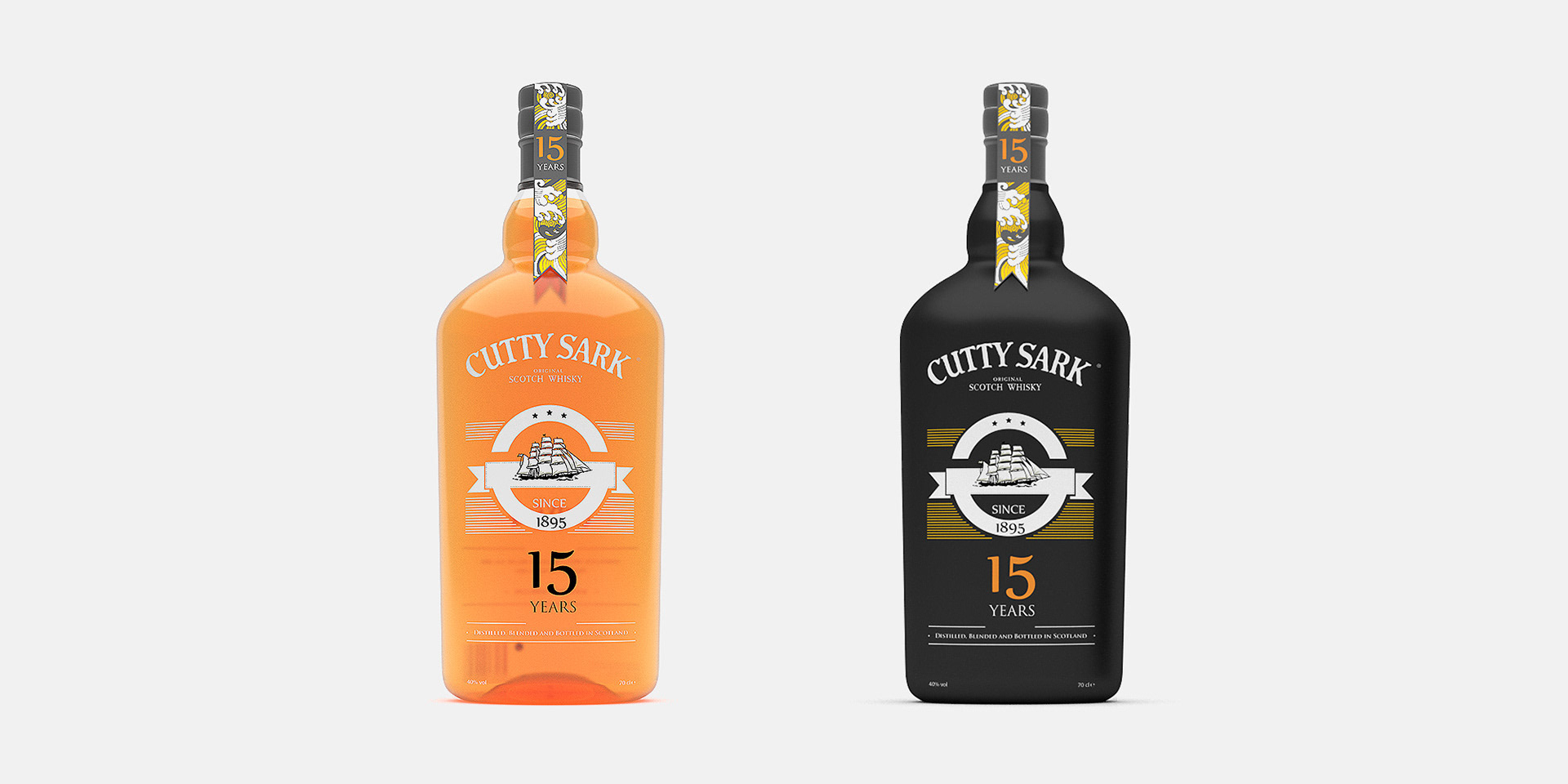
CELEBRATING 15 YEARS
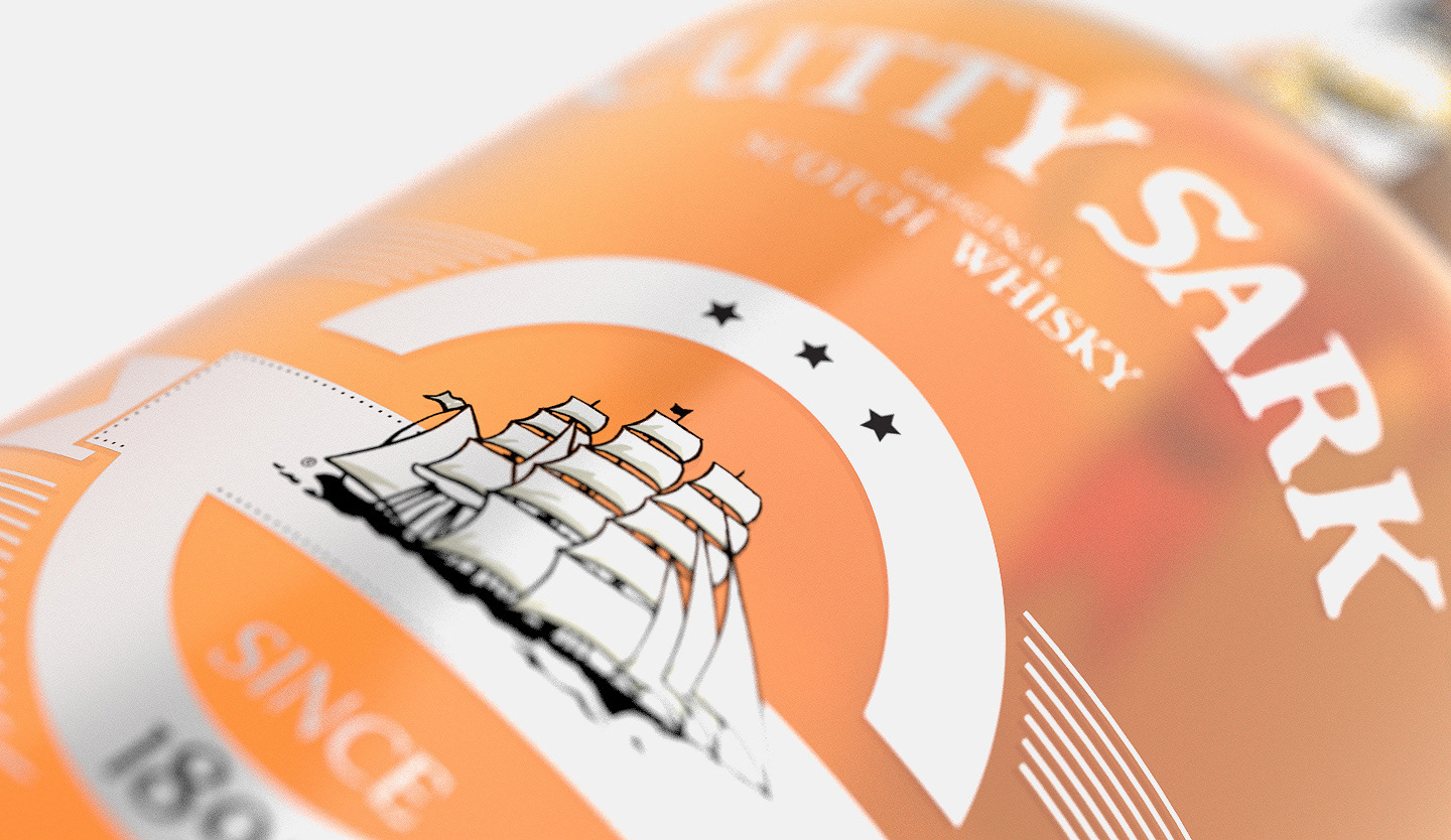
Created in 1923, with an emblematic hand-drawn ship used as its logotype.
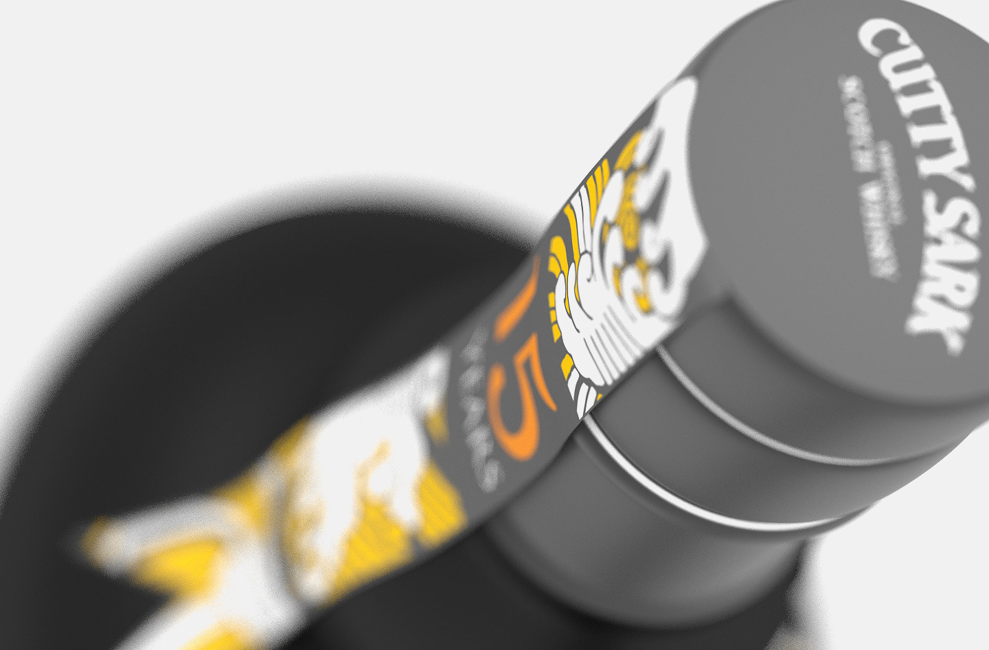
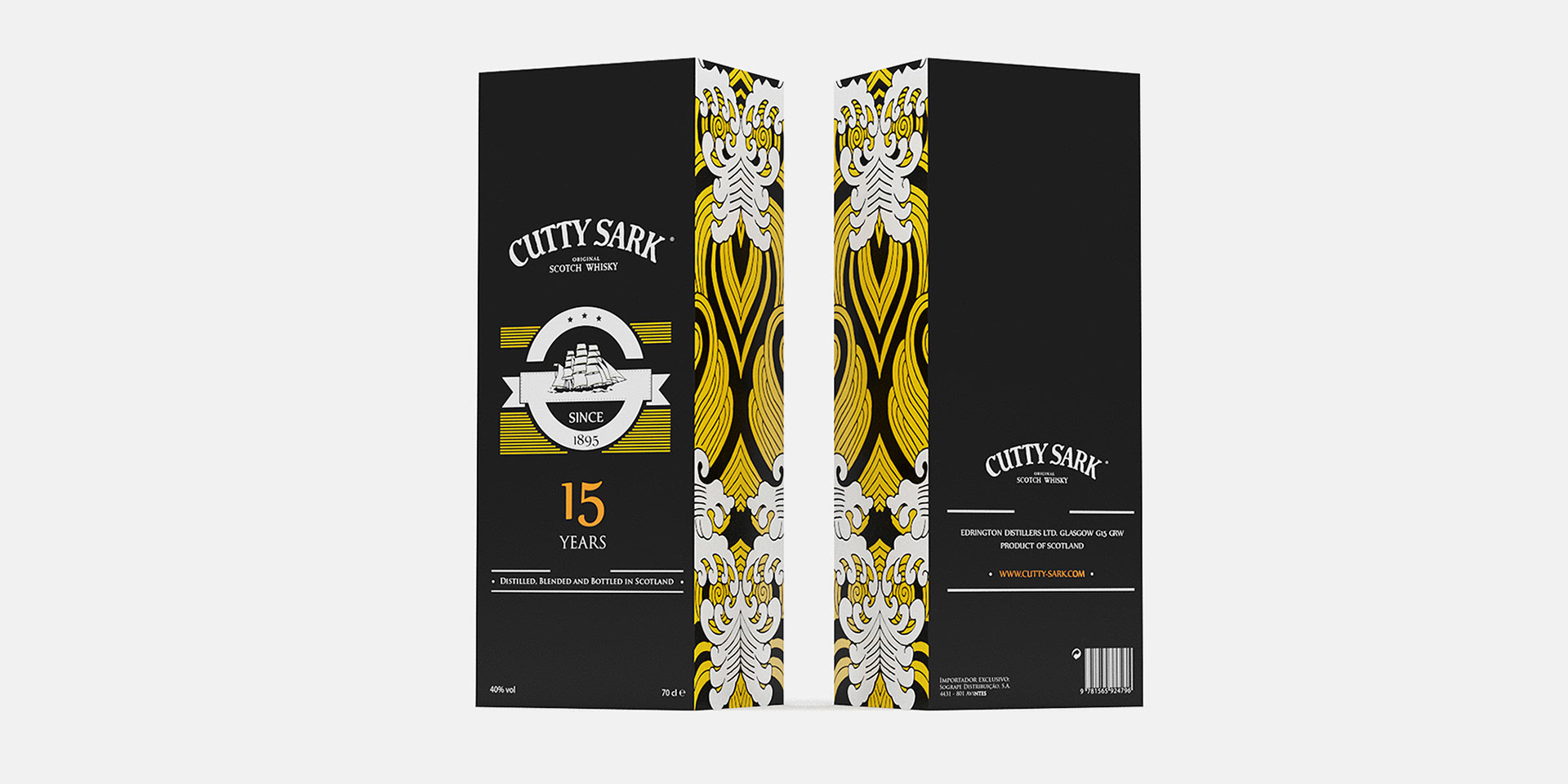
The delicate lines complement the strong printed sea illustration displayed on the ribbon and box.
A strong, serifed font gives it a classy but young-appealing look.
A strong, serifed font gives it a classy but young-appealing look.
Cantino's Soft & Black Bottle Edition (2012)


NAMING
Cantino´s based on the Cantino planisphere or the also called world map showing Portuguese
geographic discoveries in the East and West.
geographic discoveries in the East and West.
Named after Alberto Cantino, who successfully smuggled it from Portugal to Italy in 1502.
It was valuable at the beginning of the 16th century because it showed detailed and up-to-date strategic information in a time when geographic knowledge of the world was growing at a fast pace. It contains unique historical information about the maritime exploration and the evolution of nautical cartography.
Cantino's Soft & Black Bottle Edition (2012)
THE DESIGN
It was crucial to maintain the brand's identity while giving it an aesthetic, young look and evoking the thoughts of adventure. Both make use of a ribbon symbolizing the vast Sea, while making use of the distinct Cutty Sark Yellow.

